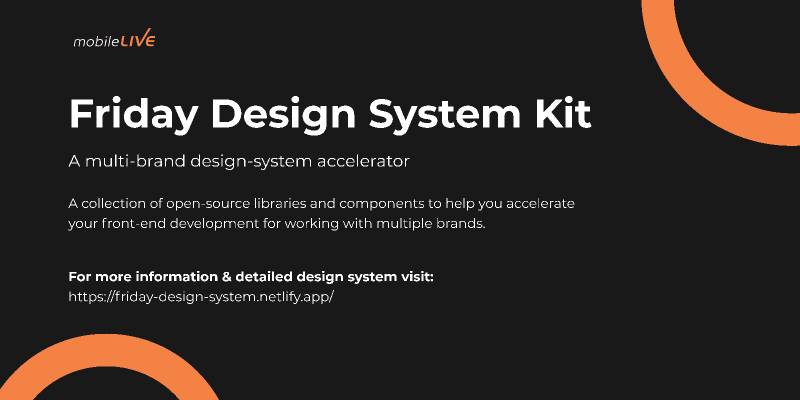
Friday Design System Figma
Related tags
Friday Design System Figma
Friday Design System (FDS) is a Design System accelerator to help you accelerate the development and design efforts for a faster time to market. It comprises open-source libraries and components that take away the pain of setting a Design System from scratch.
FDS is specifically architected to support multi-brand experiences for e-commerce and digital enterprise applications. Our team has vast experience implementing customer journeys for Telecom and BFSI sectors and we have leveraged our knowledge to ensure FDS provides components, API platforms and other core components to accelerate implementation of digital customer journeys for multi-branded experiences with cross-platform support in multiple development frameworks e.g React & Angular.
FDS is a comprehensive design system that allows you to start building multi-branded experiences. Our team has laid out foundation pieces like documentation, processes, structure, metrics, and distribution models. All the components have been fully tested and accessibility guidelines have been taken into consideration.
Friday Design System Includes:
Design Kit: - A kit of flexible, consistent and accessible components designed and maintained in Figma. It also provides best practices and guidelines for using each component along with different supported variants.
Storybook Documentation: Storybook displays development-ready components built-in react & angular and the documentation on usage and variants.
Component Library: Components architected to support multi-brand experiences supported in most popular frameworks like react and angular, and static components to accelerate your journey of design system implementation.
You can find the following items in the Design Kit V.1.1:
Design Language
- Themeable components for your brand colours/fonts
- Layout & Grid System: Breakpoints (small, medium, large & extra large devices)
- Typography: Font sizes, styles, font-weight, letter spacings and line-height etc
- Iconography: a set of font icons
- Colours: Primary, Secondary, error, warning, success etc
- Spacing Units
Components
- Buttons ( Primary, Secondary, Clear)
- Input
- Check Box
- Radio Button
- Select
- Tooltip
- Popover
- Modal
- Toast Notifications