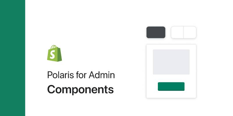
Polaris for Admin: Components Figma
2021-04-22 08:16:46
Related tags
Polaris for Admin: Components Figma
This file provides visual representations of Polaris React components in Figma.
The Polaris Web UI kit includes shared color, text, and effect styles as well as components. Use the complete UI kit in your teams or files by duplicating each of the files below from our profile page and publishing them in Figma:
- Polaris for Web: Components
- Polaris for Web: Colors
- Polaris for Web: Icons
- Polaris for Web: Typography
- Polaris for Web: Shadows
Detaching is okay! Since Figma should be a playground for design exploration, rather than a prescriptive or constraining guide, we’ve enabled detaching so you can use it as needed.

Author: Shopify
Free license: Licensed under CC BY 4.0
File type: Figma
Report resource
Edit Telmplate