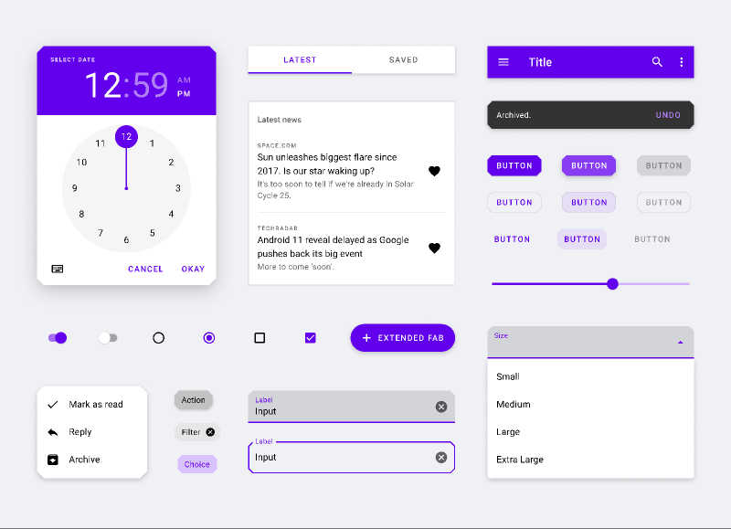
Material Theming Android 10
This is a comprehensive UI Kit that contains Material Components and Android 10 system components. It is designed to be the most faithful recreation of the MDC library for Android.
This template has:
✨ Shape Theming
Cut and Rounded corners for all themeable components.
✨ Type Theming
Text Appearance styles and code samples for all of them.
✨ Color Theming
All Material Components color attributes mapped to match production.
✨ Dark Mode support
With elevation overlays that are automatically applied to each component when switching themes!
✨ Auto Layout support
For buttons, dialogs, chips, sliders, dropdowns, notifications, list slots and menus.
✨ Auto Tint
Automatically change system bars between black and white depending on the background, just like on Android 10!
✨ Themes and Styles
Code samples on how to theme Material Components with real-world attributes used by developers!
✨ In-depth guides
Every major component contains its own guide, detailing all the customization options and built-in capabilities, as detailed in the real-world specs.
✨ Links
This template contains reference links to the implementation documents used for each component.
Latest changes (July 24th):
✔ Miscellaneous fixes
——————————
Previous changes (June 30th):
✔ Fixed button states
✔ Removed icon wrapper component
✔ Improved box stroke handling
✔ Overhauled chip components: Every variant, every state, every permutation
✔ Removed unnecessary guide sections
Design by: Eduardo Pratti