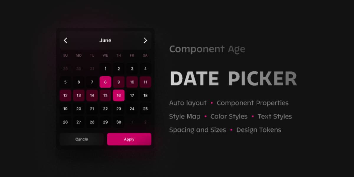
CA / Web Date Picker Figma Ui Kit
Related tags
CA / Web Date Picker Figma Ui Kit.
How to use it
The Date Picker component can be used in two ways:
One way to use it is to simply move the sample result to your project and have the benefit of a totally responsive component right away. You can easily modify its colors, font face, spacing, size, and icons to meet your needs.
You can also enjoy your creativity and alter whatever components you want to get the most desirable outcome according to your context and needs by having base components like day cells, week cell, icons and header components; state of Figma color style; text styles; spacing and sizes; design tokens at your fingertip. You’ll be your developers’ favorite by providing them design tokens.
Border Issue Solved Thanks to Figma’s New Custom Border Feature
You can have borders for each cell of your calendar and modify it as you wish without any problem; as each cell has its own specific position they won’t overlap.
CA / Date Picker enjoys having:
- Auto layout
- Component properties
- Variants (Different states)
- Design tokens
What's included:
- Theme style map
- Color styles
- Text styles
- Spacing and sizes
- Base components
- Three UI sizes (comfortable, default, compact)
- Date Picker sample
Please let me know what you like to have in the forthcoming version of the Component Age / Date Picker in the comment section.