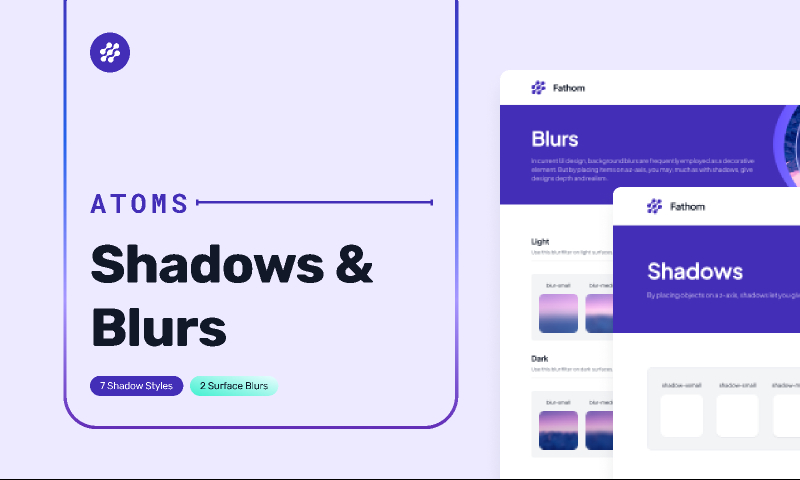
Figma Free Download Shadows & Blurs In Fathom Design System
Figma Free Download Shadows & Blurs In Fathom Design System.
Introducing Fathom Design System
Meet Fathom, a personal design system for the global community of UX. Fathom Design System provides a comprehensive introduction to the design system, with styles and components to help you get started.
As human beings, we’re very much used to how we see things in nature. That’s why mimicking what you see in nature is essential to creating fun and easy-to-use design.
How to use shadows in UI design?
If you want to use shadows in UI and UX design, following the rules nature gives us is essential. Just as with hierarchy and gestalt guidelines in design, your brain is wired to see shadows in a certain way. Therefore, creating a UI design with realistic shadows is a must-have when designing something that works well without too many hiccups.
Blur
This is particularly useful when you stack multiple objects on top of each other. The highest most levitating object also has a shadow with the highest blur value. As you know, this is because higher objects are further away from the shadow surface. The distance between the object and the shadow surface increases the blur of your shadow.
Please note that we assume there’s no angle between the object, shadow surface, and light source. Otherwise, this would have a significant effect on the shadow shape, spread, and blur. It is very common in real life but hardly ever the case in UI design.


