NativeBase v3.4 Design Kit Figma Template
Related tags
NativeBase v3.4 Design Kit Figma Template.
NativeBase components library with modular and accessible components makes it easier for designers and developers to design and build all components in their React and React Native applications.
Pick the source code from docs.nativebase.io and pick the designs from this Figma kit to churn out your new app in half the time! Want to know more about the NativeBase component UI library? Learn more.
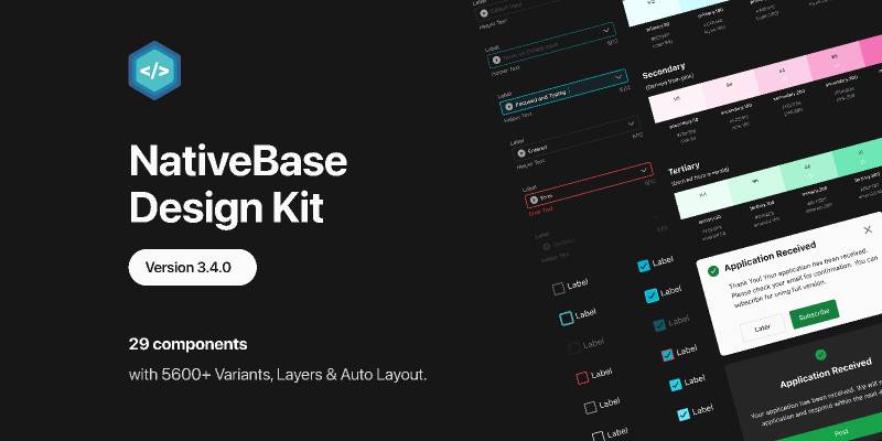
The new and upgraded NativeBase Figma Kit is here with the NativeBase version 3.4.0 release.
Here is what’s new in this components design kit:
- We redesigned multiple components including - Input, Select, Text Area, Modal, Pop-over, and AlertDialog. Read all about these changes in detail in the changelogs added inside this design kit.
- Consistency in component design, at its best.
- Infused with APCA (WCAG 3.0) Guidelines so that you don’t have to worry about it.
- Usage of semantic colors- Info, success, error, warning.
- Components with multiple variants (including states, size, theme, and much more) are available in Figma for you to develop interactive content easily.
All components are open source and available for production-level React and React Native applications. Each of the Foundation’s Style Guides and assets can be customized. Duplicate your own copy of the kit now and tweak them to your heart’s content!
