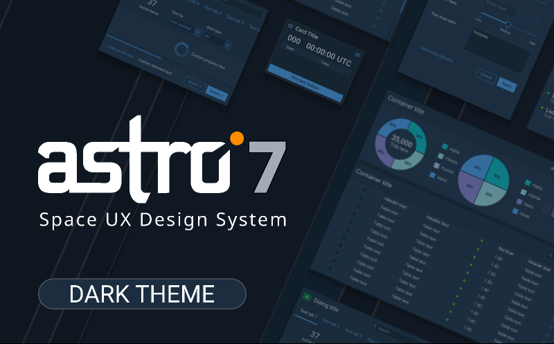
Astro 7 UXDS - Dark Theme Design System
Related tags
Astro 7 UXDS - Dark Theme Design System.
It’s an exciting time for all of us on the Astro team, as we are thrilled to announce the release of the Astro 7 Space UX Design System. Astro 7 comes with a variety of new and updated components, as well as accelerated designer and developer workflows with the release of Astro Design Tokens. We’ve also refined our color system, developed a new spacing system, and worked with our partners in the Space Force community to ensure Astro UXDS is in compliance with applicable Department of Defense standards.
Here are some of the highlights included in Astro 7:
Refined Color System
Colors received an overhaul in Astro 7. Colors from multiple DoD standards were incorporated, similar and redundant colors were consolidated, and unused colors were eliminated. Accessibility via color contrast is vitally important to Astro UXDS, so a significant effort was made to meet WCAG 2.1 Accessibility Guidance – testing color contrast for improved legibility of text and other content on background colors. Finally, Astro 7 color palettes were built into a design token library that defines all colors, variables, and usage patterns for applications, and delivers them using a consistent naming pattern.
Spacing System
To help build consistent applications, Astro 7 has adopted a new component spacing system. This 4 px spacing system has been incorporated into the dimensions and padding of all components, and the line heights of text styles. Astro 7 also includes a vertical grid system based on this spacing method, so designers can build UI mockups with consistent columns and margins between elements. This spacing system is delivered using our design token library, that defines all of the spacing and line height options available.
Design Tokens
A new design token framework and library has been developed for Astro 7. Design tokens empower designers and developers by providing platform-agnostic design decisions that define the UI elements of a design system and are your single source of truth. They can describe everything from color to border radii to typography, and follow a consistent naming convention.
New and Updated Components
While every component has been updated in Astro 7 to use design tokens and the new spacing system, there have been several notable new and enhanced components. Containers, Cards, and Pop Ups have been built to give options for delivering information to the users. Tags now provide methods for classifying and filtering information. Notification Banners have been redesigned to allow for links and icons to be added in a visually accessible manner. Trees and accordions have been redesigned to be cleaner and provide more flexibility. And the Timeline has been overhauled to deliver more functionality and development options.
Kobayashi Maru Compliance
Astro UXDS is developed in consideration of the Kobayashi Maru UX Working Group, to support consistent interface displays within the Kobayashi Maru program. To that end, Astro 7 is compliant with the Kobayashi Maru Design Standard, Version 1.6. Future versions of the design standard will be reviewed, and Astro UXDS will work to comply with and serve as a public example of these guidelines.