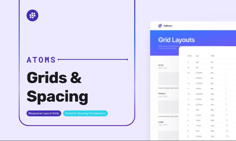
Fathom Design System: Grids & Spacing Figma Free Resource
Related tags
Fathom Design System: Grids & Spacing Figma Free Resource.
Introducing Fathom Design System
Meet Fathom, a personal design system for the global community of UX. Fathom Design System provides a comprehensive introduction to the design system, with styles and components to help you get started.
Why you need a spacing system?
Working from an established spacing system, like your color scale, helps you to work faster and more reliably. Because you're working with a restricted set of possibilities, consistent and scalable spacing helps you reduce guessing while planning and developing.
It also serves as the foundation for harmoniously and consistently arranging things onscreen, giving your designs a recognizable rhythm and order.
Designing without a defined system is chaos
Although defining a certain spacing system may appear to be a restraint, it really minimizes choice fatigue and helps you to work quicker and create better. Without a clear methodology, your designs will be haphazard and inconsistent.
Best practices
- When specifying measures, spacing, and placing components, utilize multiples of 8px.
- When additional fine-tuned modifications are required, use 4px.
- Make sure that things line up vertically and horizontally wherever feasible.
- Define a set of spacing values and try to use them in all components and layouts.
Pro tip: Change your ‘Big nudge’ amount
In Figma, you may modify your 'Big nudge' amount from 10px to 8px, causing Figma to shift your component by 8px when you press SHIFT + an arrow key.
This takes some getting used to, but it's a game changer if you're dealing with a 4px or 8px grid system.
Preferences -> Nudge amount -> Big nudge -> 8px


