WireFramer – Quick wireframing library figma free ui kit
2022-08-23 09:42:25
Related tags
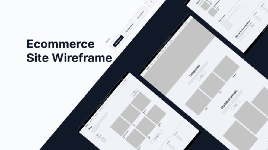
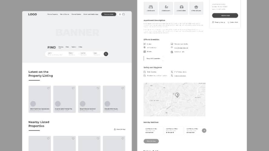
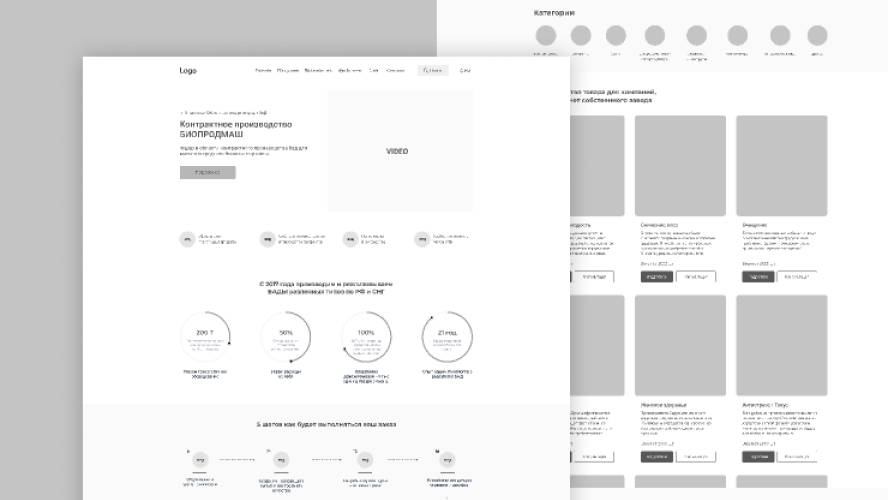
WireFramer – Quick wireframing library figma free ui kit.
Low/mid fidelity wireframing kit that aims to give you the flexibility and speed to get your ideas down quickly.
Most wireframing kits I've come across either have too many elements, or not enough. WireFramer attempts to keep main components to a minimum (so they're easy to find), but with a lot of options so you can customise.
Version 1.6
- Added Task cards, Task lists and Task Kanbans (thanks to Nick Pagee for the suggestion!)
- Fixed issue with padding options for dividers (weird Figma Auto Layout bug – they know about it!)
- Added Container component – use this to get consistent borders / corner radiuseseses (until Figma allow us to set these as styles!). Drop one in you file, detach it, add some content inside (Auto Layout applied by default).
Version 1.5
- Added U-Bend Arrows
- Added Flow Cards for mapping out product features and structure
- General tidying, fixes and improvements
- Made both ends of connector arrows configurable via Component Props (previously just start point was editable)
- Improved button structure so padding is reduced on the side(s) where icons are active
Version 1.4
- Refactored all components to take advantage of the new Component Props feature launched at Config today (5 May 2022)
- Massively reduced number of component variants, in favour of Component Props – the same (or more) options, but with less base components
- Simplified structure of many components with new Auto Layout features (eg. specific-edge borders)
Version 1.3
- Restyled various Utilities components to be more in line with wider wireframe kit
- Added 'Misc' category for less common UI elements. Includes Tooltips, Chips and Badges so far, but no doubt more elements will be added over time!
- Added 'real' body text option to all card variants
- Added alt header layout with nav bar
- Added lighter shades of accent colours
- Added option to include icon in tabs
- Added Toggle item to Inputs
- Added connector arrows with 90° bend (how did I overlook them!)
Version 1.2
- Connectors – added straight and snake arrows, with a load of variants for direction and style
- Drop-down inputs – added drop-down open state
- Buttons with drop-downs – added as a button component with open & close states, in addition to sizing and styling
- Document template – component that you can drop in supplied content for reference, or just use to add notes. Detach if you want to add other blocks.
Version 1.1
- User guide – notes on how to get the most out of WireFramer
- Component and style name prefix – all components prefixed with WF to quickly filter component search results, and to identify hangover styles when moving to high fidelity design
- Improved 'Card' blocks – combined into one Card component, with simple variants, so less searching for the right component up front
- Various improvements, fixes and tweaks throughout to make it quicker to use and more flexible
Download
Author: Tony Allsopp
Free license: Licensed under CC BY 4.0
File type: Figma
Report resource
Edit Telmplate

