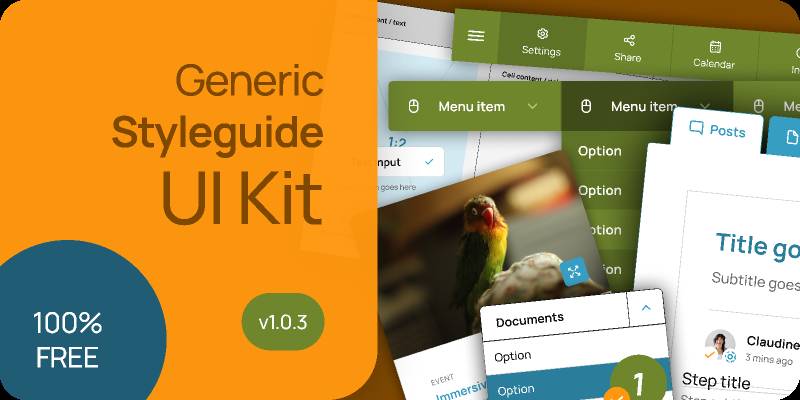
Generic styleguide + UI kit
2021-04-28 22:50:54
Related tags
Generic styleguide + UI kit
Well, this is an attempt to gather as much as possible UI elements inside a styleguide as part of a design document and share it for free 100%.
Many sections also contain an "In the Lab" part where I tweak the component's instance to demonstrate how it works.
v1.0.3
- Reworked the form control items to use the same base component
- Reworked the tabs
- Reworked the menu
- Media component
v1.0.2
- Fixed some icon issues in breadcrumb
- 3 Hero image styles added
v1.0.1
- Typography for Mobile
- Icon sizes (16px, 24px)
- Mobile menu (In the lab)
- Tooltips
Currently (v1.0) contains the following elements:
- Colours
- Typography
- Dividers/spacers
- Icons
- Buttons
- Text input
- Select
- Label
- Checkbox
- Radio buttons
- Toggle
- Switch
- Menu and submenu
- Tabs (Horizontal & vertical)
- Simple list
- Rich list
- User
- Photography
- Post/Teaser
- Tables
- Section headers
- Breadcrumbs
- Page headers
- Pagination
- Steps
I know there are much more to add but I had to start from somewhere. (I'll try to update this twice a week). Please feel free to comment and propose new elements!

Author: Costas
Free license: Licensed under CC BY 4.0
File type: Figma
Report resource
Edit Telmplate