Trading & Payments App Figma Ui Kit
Trading & Payments App Figma Ui Kit.
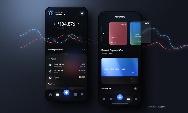
Here is my new design concept for an in-one app that can help you to make your investments, manage cards & make payments.
Colors -
(Ultramarine Blue) #305BF3 - Primary colors for button & graph.
(Very Light Azure)#6FBAFC - Used a lighter blue version for the combination.
(Cinnamon Satin) #D06978 - Used as a color combination with ultramarine blue.
(Black Coral) #4E5C75 - Used for inactive icons.
(Spanish Gray) #9C9C9C -Used for the subtitle text
(Smoky Black) #0B0C10 - Used as a background color.
Font -
Product Sans (Regular & Bold) - Used for a soft yet professional influence
Asset Link or credits -
Iron Cards by Halo Labs (Figma Community)
Techniques-
- Glassmorphism
- Iron Effect
Our designer says -
"Dark mode has been around longer than you might think. In fact, the world’s first computers used dark mode by default because screen illuminating technology wasn’t efficient enough to light up an entire screen without burning out."
Things you should consider while designing dark mode:
1. Avoid pure black
2. Avoid heavily saturated colors
3. Make sure there is enough contrast in your colors
4. Soften white backgrounds
5. Match your colors to your message
6. Communicate depth
