MasterUI 1.0 Figma Ui Kit
Related tags
MasterUI 1.0 Figma Ui Kit.
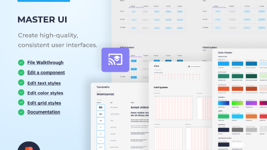
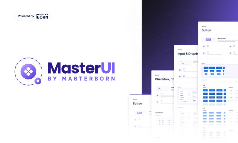
MasterUI is one step ahead of standard UI kits because while using the MASTER component, you can customise the whole kit to your needs in the blink of an eye.
This ridiculously efficient UI kit was created by MasterBorn’s Product Designers for other Figma Creators, Founders and Entrepreneurs who want to speed up their TTM (time to market).
UI kit is a smart set of UI components (eg. predefined colours, fonts, buttons) that will help designers to build a website or product faster using pre designed, ready to go, beautiful features.
MasterUI will turn a blank Figma canvas into a stunning project in just a few clicks.
Cut up to 90% of the time spent on designing components
Tired of creating each project from scratch and designing the same components over and over again? We’ve been there. We get it. That’s why we decided to develop MasterUI. Our product is a ready-made set of basic, fully editable components that will let you begin any project faster.
? Pixel perfect
We used an 8px grid to create the components — all spacing/size is 8px or its multiplier (8, 16, 24, 32 etc.).
? Auto layout
Components are built with auto-layout, so they scale easily and adapt to different resolutions.
❖ Variants
Components are organized in variants — you can easily edit the state, size, or for example, the position of the icon.
? Adjustable typography and styles
All components have defined styles and typography for global editing.
? Scalability
The library can be easily extended with your components — we have prepared an empty template to organize new components.
✏️ Editing guide
We wrote detailed documentation on how to edit and use our product.
